
How a Help Center Redesign Cut Support Tickets by 34%

Kik is a leading messaging app known for anonymous chat, media sharing, and bot interactions.
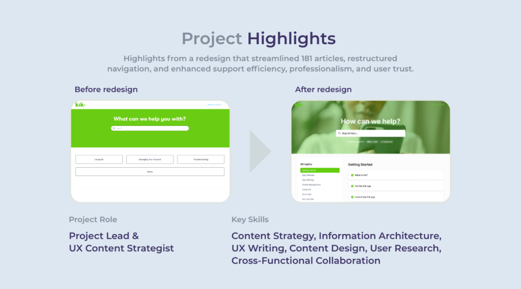
I led the complete redesign of its Help Center, from research to implementation, with a focus on making answers easier to find, reducing user frustration, and ensuring a seamless experience across all devices.

The Problem
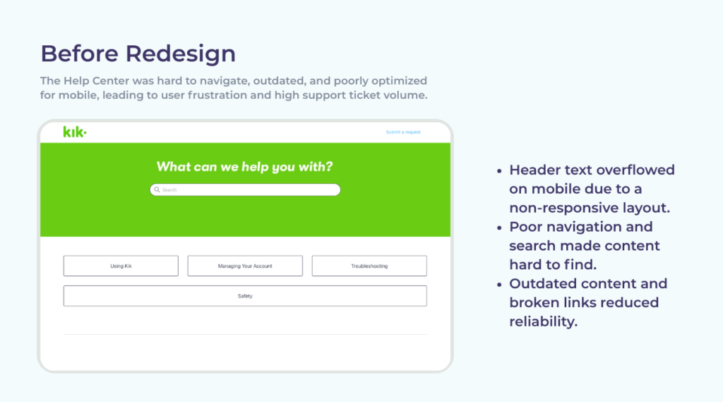
Kik’s original Help Center struggled to meet user needs. Key issues included:
- An outdated site design and article structure
- Poor mobile usability
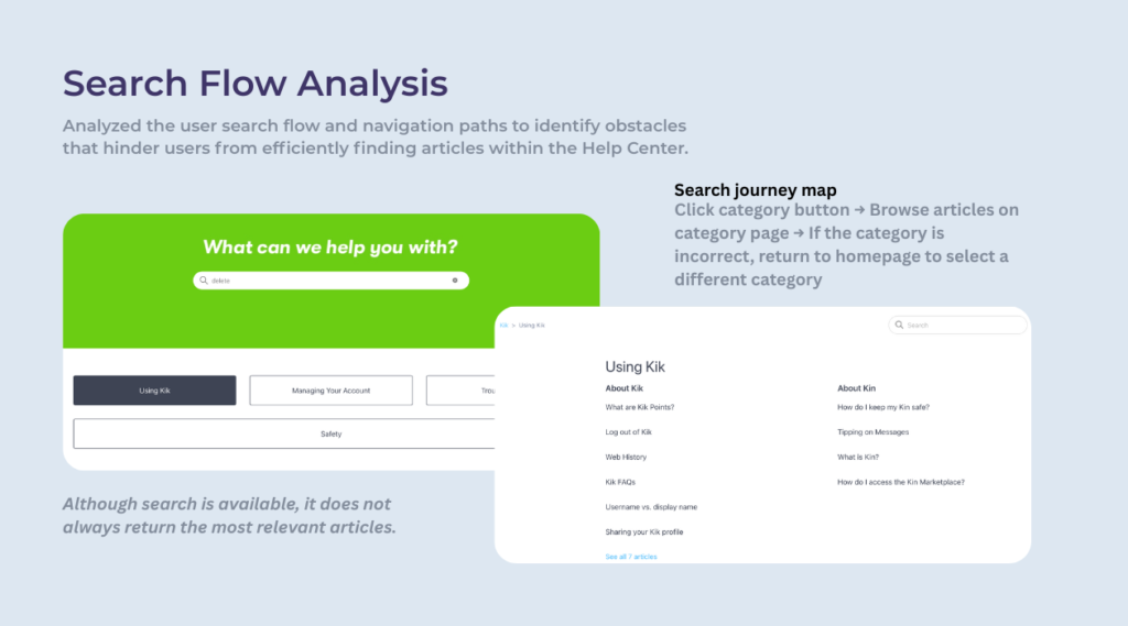
- Ineffective search functionality
- High volume of repeat support tickets
These issues led to a frustrating experience for users and placed additional strain on the support team.
Project Goals
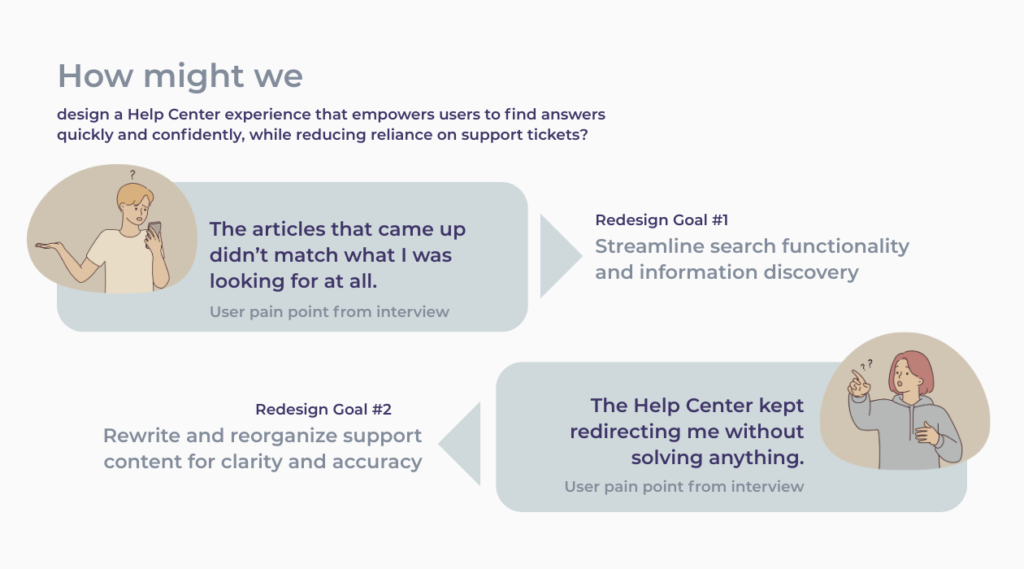
Rewriting and reorganizing support content for clarity and accuracy, along with streamlining search functionality and information discovery, directly supported the overarching goal of increasing self-service success and reducing ticket volume by helping users find reliable answers faster and with less friction.
My Role
I led the entire project end to end, including:
- Conducting research and content audits
- Redesigning the Help Center’s structure and UX
- Rewriting all support articles
- Collaborating with product, support, and design stakeholders
- Managing delivery and quality assurance through launch
The Process
Using tools like Figma, Zendesk, Confluence, and Miro, I followed a user-centered content design process:
Research & Discovery
To uncover opportunities for improvement, I began with a comprehensive content audit in Zendesk to assess article accuracy, structure, and relevance, identifying outdated information, broken links, and gaps that contributed to user confusion.
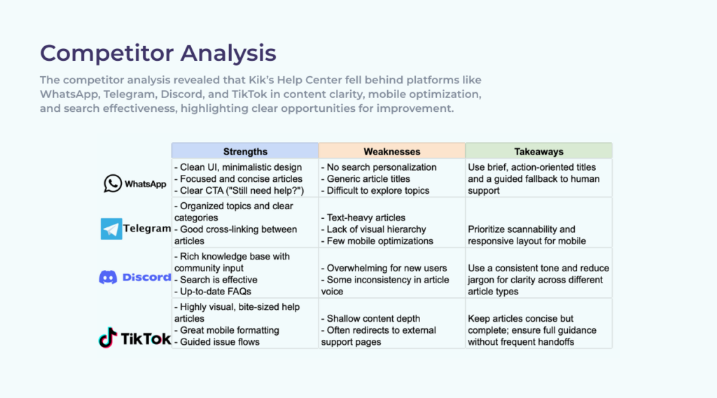
A UX heuristics review and competitor analysis revealed structural issues and accessibility gaps compared to industry standards. I also analyzed support ticket data to pinpoint common user pain points and found that users frequently searched for topics not currently addressed in the Help Center.
Strategy & Definition
Building on research insights, I defined core user needs and translated them into clear problem statements centered on outdated content, poor navigation, and lack of mobile optimization.
I set content goals focused on improving findability, clarity, and reducing friction in high-ticket areas.
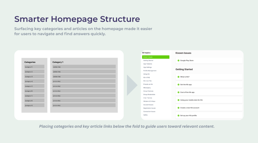
Using Miro, I mapped a new information architecture that grouped content thematically to support intuitive browsing and faster discovery.
Throughout this phase, I collaborated closely with support and product stakeholders to validate priorities and ensure alignment on structure and strategy.
Design & Development
During this phase, I created low- and high-fidelity wireframes in Figma to visualize new layouts and test content hierarchy across key Help Center templates.
All support articles were rewritten with a focus on clarity, consistency, and actionable language, simplifying technical jargon and improving scannability. Mobile-first optimization was a priority, with shorter paragraphs, more visual breaks, and testing on smaller screens to ensure readability.
We opted for a pre-built Zendesk Help Center theme to streamline development, and I customized key elements to better align with Kik’s brand and UX goals.
I worked closely with product and engineering to ensure content was accurate, technically sound, and aligned with the platform experience, while also collaborating on the design of category pages and search functionality.
Refinement & Testing
Refinement and validation were essential to ensuring the Help Center redesign met both user needs and business goals.
I facilitated internal content reviews with support agents and team leads to confirm accuracy, tone, and completeness before launch. To improve search performance, I optimized metadata, article titles, and tags within Zendesk’s constraints based on top user queries.
Informal user testing with internal users and support staff helped validate usability and uncover final content and navigation refinements.
I also conducted a full QA review in staging to check formatting, link accuracy, accessibility, and visual consistency across devices.
Implementation & Launch
The redesigned Help Center was launched with a strong focus on sustainability and measurable impact.
To support long-term success, I created internal documentation in Confluence outlining the new information architecture, writing standards, and maintenance workflows.
During rollout, I provided hands-on support, monitored live performance, and resolved post-launch content issues. I also set up analytics dashboards to track key metrics like self-service success, article engagement, and reductions in support tickets for high-volume topics.
Final Thoughts
This redesign was about more than just a fresh coat of paint. It was a chance to make the help center actually helpful, with clearer content, better navigation, and a smoother mobile experience.
Over the course of the project, 181 new articles were created, the structure was rebuilt for clarity, and search functionality was improved.
After launch, the results were clear: a 71.4% increase in click-through rate and a 34% reduction in support tickets. The new help center made things easier for users and took pressure off the support team.