
Making it easier for users to find answers—and ask fewer questions
Kik’s Help Center was creating more confusion than clarity. Outdated content and a clunky experience made even simple questions hard to answer, leading to repeated support tickets and frustrated users.
Scope
End-to-end redesign
Role
Content Design
Strategy
Results
71.4% CTR increase
34% ticket reduction
Overview
Kik is a messaging app centered on real-time communication and social connection, where users regularly look for quick help to manage accounts, messages, and app features.
Context
Users came to Kik’s Help Center looking for quick answers, but often left with more questions. Outdated content, inconsistent structure, and weak search made it difficult to find accurate information, ultimately leading to confusion and repeated support requests.
Approach
I led the end-to-end redesign of the Help Center, restructuring the information architecture, rewriting content for clarity, and optimizing search so users could more easily find relevant answers and resolve issues on their own.
Goals
- Improve findability and self-service success
- Reduce repeat support tickets
- Create a scalable, maintainable content system
- Deliver a seamless mobile-first experience
Role
- Defined content strategy and IA
- Conducted audits and analyzed support data
- Rewrote 180+ support articles
- Partnered with product, support, and engineering
- Led implementation, QA, and launch
The Problem
The Help Center wasn’t effectively supporting users or reducing reliance on support.
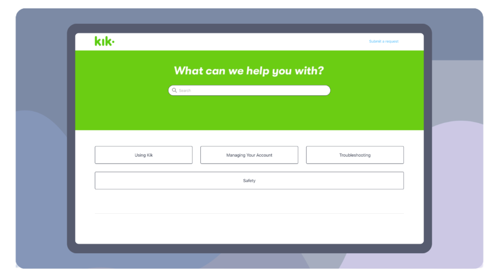
Key issues included:
- Outdated and inconsistent content across articles
- Gaps in coverage for high-frequency user questions
- Search that failed to surface relevant answers
- Poor mobile readability and dense formatting
- High volume of repeat tickets on common issues
Despite existing content across the Help Center, users still struggled to find clear, actionable answers, especially for common tasks like account access, profile updates, and feature usage.
Approach
1. Understanding where users were getting stuck
I began with a full audit of existing content and support tickets to identify breakdowns in the user journey.
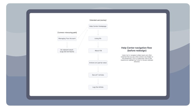
This revealed:
- High-volume issues were often missing, outdated, or poorly explained, limiting users’ ability to resolve common problems
- Articles were difficult to scan, especially on mobile
- The category-based navigation structure created friction, requiring users to drill through multiple layers, navigate incomplete article lists, and rely on “see all” pages to access full content. Entering the wrong path often meant restarting from the homepage
In many cases, users reached relevant subcategories but were unable to see all available articles without taking an additional step, creating unnecessary friction in otherwise simple tasks.
2. Prioritizing user intent and scanning behavior
Rather than forcing users to navigate through multiple layers of categories, I restructured the Help Center to surface a broader set of topics directly on the homepage. This reduced the need to drill down and made it easier for users to quickly identify and access relevant content.
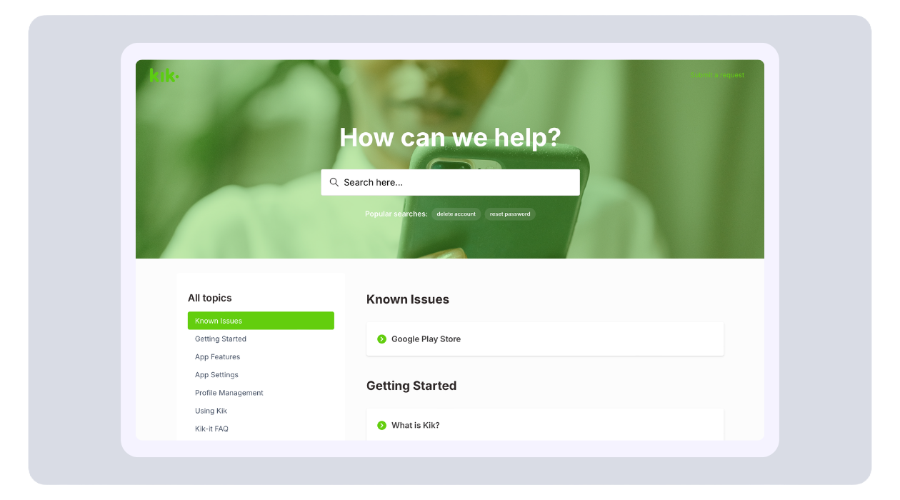
I selected a theme that surfaces all top-level categories directly on the homepage, making it easier for users to scan and access relevant topics without navigating through multiple layers. This better aligns the structure with how users naturally browse and search for help content.
3. Designing a scalable content system
Without a dedicated UX or design team, I used the Zendesk theme as a foundation and focused on consistency through content design.
Content standards:
- A flexible article structure supporting both quick answers and in-depth guidance depending on user need
- Standardized formatting rules to improve readability and scanability across devices
- A defined voice and tone system to ensure consistency across all support content
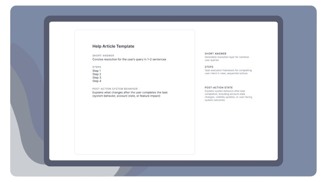
This structure ensured consistency across 180+ articles while allowing flexibility based on the complexity of each user task.
4. Rewriting content for clarity and mobile use
All articles were rewritten to:
- Remove outdated or redundant information
- Use simple, action-oriented language
- Break content into shorter, scannable sections
- Prioritize mobile readability
Given Kik’s mobile-heavy audience, this shift significantly improved usability.
5. Optimizing for search and discovery
Because users primarily rely on search within Help Centers, I optimized content to better match real user queries and improve discoverability.
This included:
- Rewriting article titles using natural user language and phrasing
- Improving metadata and tagging to better surface relevant content in search results
- Aligning content structure with high-frequency search terms and intents
This ensured users could find answers using the same language they naturally used when searching.
Key Decisions
Prioritizing search over navigation
Support data showed users relied more on search than browsing, so I focused first on improving search relevance before expanding navigation patterns.
Adopting a category-based information architecture to support browsing efficiency
I restructured the Help Center around clear top-level categories surfaced on the homepage, reducing multi-layer navigation and improving visibility into available content.
Using a pre-built theme instead of custom design
To move quickly and work within constraints, I leveraged an existing Zendesk theme and focused efforts on content and structure where impact would be highest.
Adopting a mobile-first content model
Given Kik’s user base, I prioritized scannability, shorter content blocks, and simplified layouts over desktop-heavy patterns.
Impact
This project resulted in measurable improvements in user engagement, self-service success, and support efficiency across the Help Center.
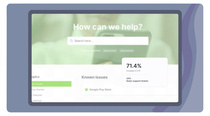
Key impact areas:
- Increased user engagement with help articles
- Reduced reliance on support for high-volume issues
- Improved self-service success across common tasks
- Established a scalable content maintenance system
Overall, the changes created a more scalable, user-centered Help Center that better supports both user needs and internal support operations.
The Difference
Before
- Outdated, inconsistent articles
- Poor search relevance
- Dense, hard-to-scan content
- High support dependency
After
- Clear, task-based content
- Improved search alignment
- Mobile-optimized, scannable articles
- Reduced support volume
Reflection
1. Key takeaway
This project reinforced that a Help Center isn’t just a repository of articles but a product experience in and of itself. By aligning content structure, search behavior, and user needs, I improved both usability and operational efficiency.
2. What I’d explore next
If I were to extend this work, I’d focus on bringing support into the product itself through contextual help and proactive guidance, reducing the need for users to leave the app to find answers.